Andre Kertesz

image retrieved from:http://upload.wikimedia.org/wikipedia/en/thumb/b/b5/Kertesz_The_Fork.jpg/250px-Kertesz_The_Fork.jpg
This picture makes the viewer notice the specific arrangement of the fork and plate, as if the artist deliberately arranged the objects in this order because the viewer's eyes are instantly attracted to the linear patterns. The patterns makes the object seem less ordinary because we are more focused on the aesthetics of the object, not it's functionality. I like how the artist does this because it shows how a photograph has the ability to change our view of something even as basic as a fork and allows the audience to appreciate the object in a more artistic way or at least see it as more than just a boring utensil. The fork and shadow create parallel diagonal lines which leads the audiences eyes towards the other end of the object where the pattern is, so this helps the viewer's eyes travel across the whole photograph. Black and white emphasizes contrast and allows the audience to focus on the brightly lit objects.
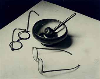
image taken from:
http://www.christies.com/lotfinderimages/D53995/andre_kertesz_mondrians_pipe_and_glasses_paris_1926_d5399565h.jpg
This image effectively uses a dark background against a lit up base and this gives off a surreal or artificial look which works with the artificial lights used to light up this picture. The spectacles dont produce a strong shadow like the ash tray which shows that it's not particularly necessary to have shadows in order to portray the idea of light or emphasize it. The artist once again arranges the objects that deliberately controls the viewer's eyes and the movement of the picture, ie the glasses closest to the camera are what the viewer's see first, then the objects in the background etc...
The objects used are also purposely chosen to represent the artist, as if it's iconic, and perhaps by chance there is repetition in the shapes in the objects (circular chapes), which could also be deliberately done in order to give a less harsh, edgy look, which works with the faint shadows. I think that these ideas would work together to portray femininity because it gives off a more harmonious effect.
Edward Weston

taken from:
http://www.dailyartfixx.com/wp-content/uploads/2011/03/Cabbage-Leaf-Edward-Weston-1931.jpg
The artist uses a cabbage leaf and uses downlighting to emphasize the creases and texture of the leaf. This then changes the perception of the leaf so that it looks like a sheet or fabric. This is a good example of how light controls or effects how an object is viewed. Downlighting is particularly effective when it comes to trying to bring out shadows and contrast, as well as spotlighting. This picture may have heaps of contrast between dark and light, but because the smooth curves of the cabbage leaf are exaggerated, it gives off a more feminine look instead of a masculine look. I think that this would be something to consider for my photographs; can I still portray femininity or masculinity using unconventional lighting? how will this effect/transform my image?

image taken from:
http://www.sfmoma.org/images/artwork/large/62.434.C_01_b03.jpg
This picture is trying to show the relationship between the shape of this root vegetable and the shape of human hands. The black background helps isolate the vegetable and brightens up the appearance of light. Like the picture of the cabbage leaf, this picture also uses spot lighting to show pattern and texture. The photo has been cropped so that the entire vegetable is not shown, allowing the viewers to ponder what the object may be. This also offers a more abstract view of the object which manipulates the audience to confuse the vegetable for a hand. The artist would've considered how the image would be composed before photographing, so this makes me think that I should plan out my photographs and generate some thumbnails so that I can think about how I will control the picture and what the audience perceives.
Erwin Blumenfeld

image taken from:
https://blogger.googleusercontent.com/img/b/R29vZ2xl/AVvXsEiP7PA4_n0irQs2168HKgQd1YcwSeCsdsbRGJHKBXB6ErBZZix786qr7eKyOQtfcGLxn-EwmNE8ys_WnalqWOLm8zAwLwb2pPdLAHDmx5FO8qkC4I_oRt1xwqdTUxASMUPzWkJt6iEC60g/s1600/copyright-estate-of-erwin-blumenfeld-425x535.png
This picture captured my attention because the use of light which may seem scarce but it's because of this that it manages to stand out the most in this picture. The first thing that the audience notices is the thick strip of light being shone on the subject's face, which accentuates the shapes and edges of her face. Although there is a lot of contrast, there are still elements of femininity because the viewer follows the curves of the face which is emphasized by the narrow ray of light against the subject's face, and it's brightness stands out against the dark features, which brings out a subtle softness in the picture. The darkness is not too strong however, allowing the viewer to see most of the subjects face even though it is not completely lit up. The artist used a very basic camera angle and view of the face (ie, it's not abstract) because the picture is straightforward and the idea that the audience takes from this picture is that we are to focus on the emotions or expressions on the face rather than trying to decipher what the image could be. This could be an idea that I could try to express in my photos- to show the images for what they are but use only light to portray femininity or masculinity.

image taken from:
https://blogger.googleusercontent.com/img/b/R29vZ2xl/AVvXsEh8qns4lZbgODsundDoYkQiwqKKfbHXA_E9eHFF5-jjnCxU5X06beNPiNindh-VRgrVmCW8X23Hor8wLm2zKMovYXBwTHnldR553ZwJ6r0Y_baYzYFYflMdUbghVhKqye_-phRSC_940nU/s1600/Outline-New-York-_-Erwin-Blumenfeld_-1963.jpg
when I first saw this picture, I got slightly confused because for me the deep shadows help the body appear more masculine. Perhaps it was the photographers intention to portray the subject this way, but as a viewer, I thought it was not successfully portraying femininity. If there was more light and less shadows on the body, then I think that it would make the subject appear less dramatic and less masculine because strong shadows and contrasts depict a certain harshness that would work with the idea of masculinity, but because femininity tends to have a softer look, the contrast and darkness eliminates this.This makes me question how i will have to pick the right kind of lighting to set the picture in the right atmosphere.
Victor Schrager

image retrieved from: http://www.victorschrager.com/images/home/exhibition.jpg

retrieved from:
http://www.candacedwan.com/jelly/data/photograph/image/Maximum_Width=1000,Maximum_Height=322/6825.jpg
I chose to look at this artist's work because I thought it was refreshing how the artist captures light and shadow without the need to make the image in black and white, and I also liked the natural look of the light, because for me it reminds me of femininity. The rays of natural light are more spread out and there fore make the light appear less concentrated and more ambient, creating softer shadows and less contrast, which as Ive already exhausted many times in my research, appears more feminine. The objects that are used are neither specifically feminine or masculine but the light and colours used in these photos help guide the viewers visually as to what the object is about. For me the objects look like books, which is not a gender specific object, but the washed out colours and light gives the pictures character and lean towards a more feminine view of a basic object such a a book. I also like how the artist focuses on the foreground images because it emphasizes the softness of the picture further, so that is one way to complement the lighting.


.jpg)
.jpg)
.jpg)