I have uploaded my contact sheet through Issuu.com, to access my contact sheets for this project, my URL is:
thttp://issuu.com/maysali/docs/light_144_contact_sheet
Showing posts with label #dsdn144. Show all posts
Showing posts with label #dsdn144. Show all posts
Monday, 28 May 2012


final proposal and images
Proposal
I wanted to experiment with the idea of masculinity and femininity and and wanted to find out if these two characteristics can be expressed through light. The idea came to me when I had been thinking about old hollywood films, particularly film noir, where lighting was a heavy visual input that separated how the audience recognized the difference between Men and Women. So for this project I wanted to see if this does in fact effect our (the audience) perception of masculine and feminine objects, and through my photographs prove that the way we see how light is displayed does instinctively draw connections between what we see and what we associate it with.
I intended to use various kinds of lighting at first, but then when I went through some artists that helped shape my work I narrowed down my ideas to end up with only a few types of lighting that seemed to reoccur throughout most of my precedent's works, which showed that femininity involved brighter lit atmospheres while masculinity involved more shadows and contrast. For this project I ended up using a lot of down lighting to achieve this contrast and then ambient lighting using a white umbrella-like tool to soften the sharpness of direct light. I initially wanted to use abstract angles and points of views, but then I thought that it may confuse the audience too much, and since I want the audience to easily comprehend the photographs I think i should make it slightly straightforward so that it doesn't end up looking too basic or too abstract.
I decided to use this idea because it interested me how femininity and masculinity can be visually recognized and communicated through particular conventions or typical features that allows individuals to categorize whether something is masculine or feminine. Im not aiming to target a specific audience, but allow the viewers to think about how things around us are designed specifically to attract a group or market audience and how gender helps the object become more attractive for the two different groups. this would then ingage the viewers and allow them to think about gender in depth and why manufacturers and designers focus so much on making gender-specific items and how they achieve this.
for my final output I intend to use 4-6 of my strongest pictures that communicate my ideas and appear artistic and thoughtful enough to grab the audience's attention. I want the main focus of the collection to be about light and how different kinds of light depict masculinity and femininity, so when the audience see my photographs I intend on the light source to be the first thing to stand out, before they decipher what is n the rest of the photo.
final images


I wanted to experiment with the idea of masculinity and femininity and and wanted to find out if these two characteristics can be expressed through light. The idea came to me when I had been thinking about old hollywood films, particularly film noir, where lighting was a heavy visual input that separated how the audience recognized the difference between Men and Women. So for this project I wanted to see if this does in fact effect our (the audience) perception of masculine and feminine objects, and through my photographs prove that the way we see how light is displayed does instinctively draw connections between what we see and what we associate it with.
I intended to use various kinds of lighting at first, but then when I went through some artists that helped shape my work I narrowed down my ideas to end up with only a few types of lighting that seemed to reoccur throughout most of my precedent's works, which showed that femininity involved brighter lit atmospheres while masculinity involved more shadows and contrast. For this project I ended up using a lot of down lighting to achieve this contrast and then ambient lighting using a white umbrella-like tool to soften the sharpness of direct light. I initially wanted to use abstract angles and points of views, but then I thought that it may confuse the audience too much, and since I want the audience to easily comprehend the photographs I think i should make it slightly straightforward so that it doesn't end up looking too basic or too abstract.
I decided to use this idea because it interested me how femininity and masculinity can be visually recognized and communicated through particular conventions or typical features that allows individuals to categorize whether something is masculine or feminine. Im not aiming to target a specific audience, but allow the viewers to think about how things around us are designed specifically to attract a group or market audience and how gender helps the object become more attractive for the two different groups. this would then ingage the viewers and allow them to think about gender in depth and why manufacturers and designers focus so much on making gender-specific items and how they achieve this.
for my final output I intend to use 4-6 of my strongest pictures that communicate my ideas and appear artistic and thoughtful enough to grab the audience's attention. I want the main focus of the collection to be about light and how different kinds of light depict masculinity and femininity, so when the audience see my photographs I intend on the light source to be the first thing to stand out, before they decipher what is n the rest of the photo.


Editing
Ive cropped my chosen images and made them black and white because I have noticed that most of my precedents use black and white photography to bump up the appearance of shadows and to make the contrast between dark and light shades stand out more. I think that by taking away colours the audience will focus more on how my idea of representing femininity and masculinity through specific lighting, rather than focusing on other factors that may influence this.





development of my idea and proposal / next shoot
After going through more artist precedents, I have thought of ways to improve my existing idea and proposal, and also after my first two shoots, I dont think that by photographing objects solely projects my ideas effectively because I dont think that it is strong enough to show the differences between gender characteristics since the viewers dont necessarily understand what I am trying to show in context. For example when I take a photo of a lipstick case, whether it be in an abstract style or not, the pictures dont read out what I am trying to show, instead the viewer focuses on what the object is as opposed to thinking about what it represents and how light effects out views of masculinity or femininity.
So for my next shoot I used myself as a subject and took a series of photographs where I use ambient and soft lighting for situations where I would use masculine objects and feminine objects and vice versa with darker, more high-contrast key lighting. This way I can manipulate the audience, even for just a second, and almost confuse them when they see the contradictions that I use in the photographs.
This means that I will have to make some small changes to my proposal in order to explain this idea clearer.
shoot 3: (dont let my face scare you, I have a fantastic personality)


(I look like my uncle :S )
I had the idea of using a women's makeup brush and use it as a way to show manly facial hair such as a moustache, beard etc... and accompany it by using a half lit face to complement the contradiction of using a feminine object to create the appearance of a man. The idea of using a half-lit face came from Erwin Blumenfeld's photograph where the lighting was brighter on one side of the model's face than it was on the other side.
So for my next shoot I used myself as a subject and took a series of photographs where I use ambient and soft lighting for situations where I would use masculine objects and feminine objects and vice versa with darker, more high-contrast key lighting. This way I can manipulate the audience, even for just a second, and almost confuse them when they see the contradictions that I use in the photographs.
This means that I will have to make some small changes to my proposal in order to explain this idea clearer.
shoot 3: (dont let my face scare you, I have a fantastic personality)


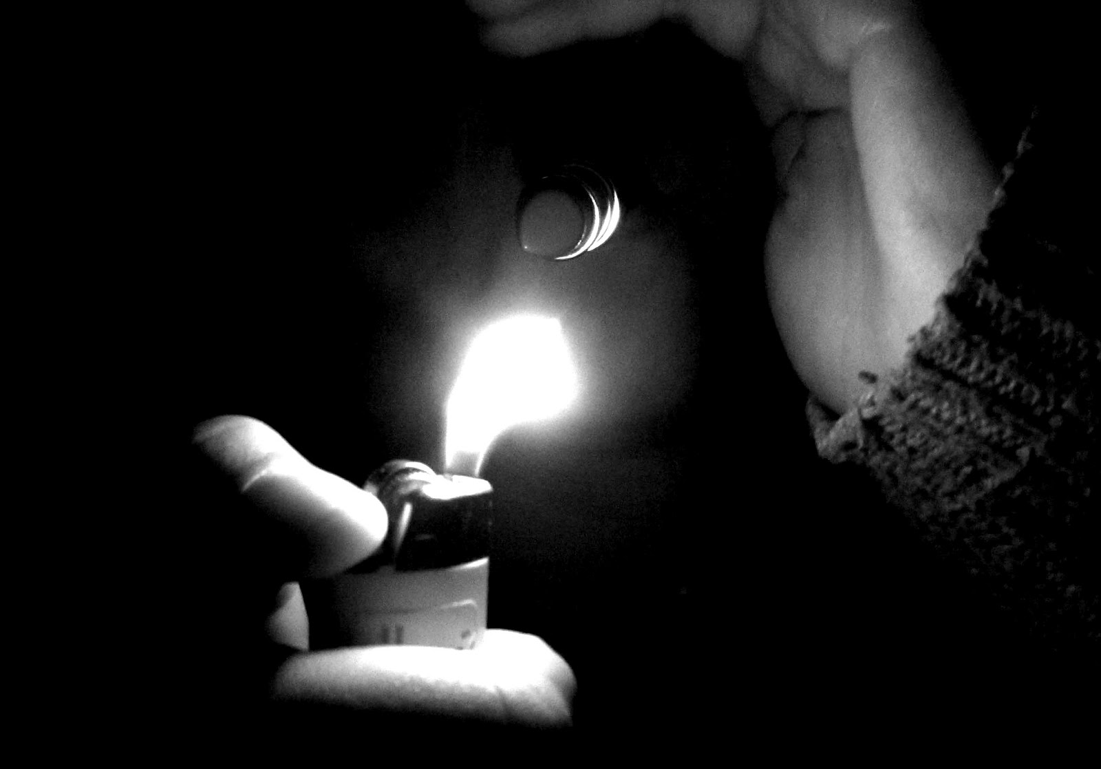
This idea i used very scarce light, like Erwin Blumenfeld's idea for his photograph, to show the smoothness of the face and lipstick in a subtle way. This is because I just wanted to experiment with different kinds of lighting to see which one would be effective and since I wanted to portray smoking in a masculine way (since it is typically perceived as a 'manly' thing to do, and the idea was taken from film noir, where the male leads characteristics tend to include smoking addictions) strong contrast work with that idea.


Here I used pliers, an object commonly associated with masculinity, and used them as manicure scissors which is a typically feminine object. I used two bright spotlights at first to achieve a downlighting look, but decided that by making the light ambient and less direct, I would end up with a less harsh look that is still bright and relates stronger to femininity. I took these ideas from my precedent, Bill Brandt, who uses downlighting thats ambient and bright so that the shadows dont become too strong, but there's still definition in the shapes and spaces within the subjects' body parts.


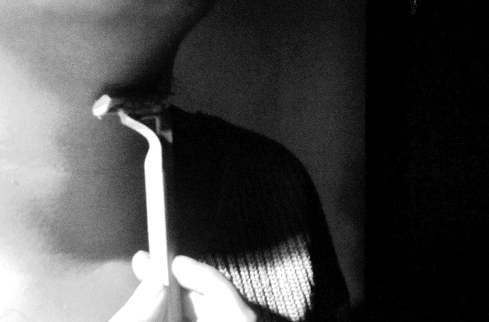
Using a women's disposable shaver and very strong key lighting, I tried to get a masculine effect through the heavy contrast lighting. This idea was heavily influenced by film noir where the male characters are famously depicted in strong key lighting. I thought that this would be effective in my photographs because the audience would understand or have a better idea of what I am trying to show in my pictures.


(I look like my uncle :S )
I had the idea of using a women's makeup brush and use it as a way to show manly facial hair such as a moustache, beard etc... and accompany it by using a half lit face to complement the contradiction of using a feminine object to create the appearance of a man. The idea of using a half-lit face came from Erwin Blumenfeld's photograph where the lighting was brighter on one side of the model's face than it was on the other side.
Sunday, 27 May 2012
precedents for project 3
Andre Kertesz

image retrieved from:http://upload.wikimedia.org/wikipedia/en/thumb/b/b5/Kertesz_The_Fork.jpg/250px-Kertesz_The_Fork.jpg
This picture makes the viewer notice the specific arrangement of the fork and plate, as if the artist deliberately arranged the objects in this order because the viewer's eyes are instantly attracted to the linear patterns. The patterns makes the object seem less ordinary because we are more focused on the aesthetics of the object, not it's functionality. I like how the artist does this because it shows how a photograph has the ability to change our view of something even as basic as a fork and allows the audience to appreciate the object in a more artistic way or at least see it as more than just a boring utensil. The fork and shadow create parallel diagonal lines which leads the audiences eyes towards the other end of the object where the pattern is, so this helps the viewer's eyes travel across the whole photograph. Black and white emphasizes contrast and allows the audience to focus on the brightly lit objects.
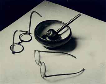
image taken from:
http://www.christies.com/lotfinderimages/D53995/andre_kertesz_mondrians_pipe_and_glasses_paris_1926_d5399565h.jpg
This image effectively uses a dark background against a lit up base and this gives off a surreal or artificial look which works with the artificial lights used to light up this picture. The spectacles dont produce a strong shadow like the ash tray which shows that it's not particularly necessary to have shadows in order to portray the idea of light or emphasize it. The artist once again arranges the objects that deliberately controls the viewer's eyes and the movement of the picture, ie the glasses closest to the camera are what the viewer's see first, then the objects in the background etc...
The objects used are also purposely chosen to represent the artist, as if it's iconic, and perhaps by chance there is repetition in the shapes in the objects (circular chapes), which could also be deliberately done in order to give a less harsh, edgy look, which works with the faint shadows. I think that these ideas would work together to portray femininity because it gives off a more harmonious effect.
Edward Weston

taken from:
http://www.dailyartfixx.com/wp-content/uploads/2011/03/Cabbage-Leaf-Edward-Weston-1931.jpg
The artist uses a cabbage leaf and uses downlighting to emphasize the creases and texture of the leaf. This then changes the perception of the leaf so that it looks like a sheet or fabric. This is a good example of how light controls or effects how an object is viewed. Downlighting is particularly effective when it comes to trying to bring out shadows and contrast, as well as spotlighting. This picture may have heaps of contrast between dark and light, but because the smooth curves of the cabbage leaf are exaggerated, it gives off a more feminine look instead of a masculine look. I think that this would be something to consider for my photographs; can I still portray femininity or masculinity using unconventional lighting? how will this effect/transform my image?

image taken from:
http://www.sfmoma.org/images/artwork/large/62.434.C_01_b03.jpg
This picture is trying to show the relationship between the shape of this root vegetable and the shape of human hands. The black background helps isolate the vegetable and brightens up the appearance of light. Like the picture of the cabbage leaf, this picture also uses spot lighting to show pattern and texture. The photo has been cropped so that the entire vegetable is not shown, allowing the viewers to ponder what the object may be. This also offers a more abstract view of the object which manipulates the audience to confuse the vegetable for a hand. The artist would've considered how the image would be composed before photographing, so this makes me think that I should plan out my photographs and generate some thumbnails so that I can think about how I will control the picture and what the audience perceives.
Erwin Blumenfeld

image taken from:
https://blogger.googleusercontent.com/img/b/R29vZ2xl/AVvXsEiP7PA4_n0irQs2168HKgQd1YcwSeCsdsbRGJHKBXB6ErBZZix786qr7eKyOQtfcGLxn-EwmNE8ys_WnalqWOLm8zAwLwb2pPdLAHDmx5FO8qkC4I_oRt1xwqdTUxASMUPzWkJt6iEC60g/s1600/copyright-estate-of-erwin-blumenfeld-425x535.png
This picture captured my attention because the use of light which may seem scarce but it's because of this that it manages to stand out the most in this picture. The first thing that the audience notices is the thick strip of light being shone on the subject's face, which accentuates the shapes and edges of her face. Although there is a lot of contrast, there are still elements of femininity because the viewer follows the curves of the face which is emphasized by the narrow ray of light against the subject's face, and it's brightness stands out against the dark features, which brings out a subtle softness in the picture. The darkness is not too strong however, allowing the viewer to see most of the subjects face even though it is not completely lit up. The artist used a very basic camera angle and view of the face (ie, it's not abstract) because the picture is straightforward and the idea that the audience takes from this picture is that we are to focus on the emotions or expressions on the face rather than trying to decipher what the image could be. This could be an idea that I could try to express in my photos- to show the images for what they are but use only light to portray femininity or masculinity.

image taken from:
https://blogger.googleusercontent.com/img/b/R29vZ2xl/AVvXsEh8qns4lZbgODsundDoYkQiwqKKfbHXA_E9eHFF5-jjnCxU5X06beNPiNindh-VRgrVmCW8X23Hor8wLm2zKMovYXBwTHnldR553ZwJ6r0Y_baYzYFYflMdUbghVhKqye_-phRSC_940nU/s1600/Outline-New-York-_-Erwin-Blumenfeld_-1963.jpg
when I first saw this picture, I got slightly confused because for me the deep shadows help the body appear more masculine. Perhaps it was the photographers intention to portray the subject this way, but as a viewer, I thought it was not successfully portraying femininity. If there was more light and less shadows on the body, then I think that it would make the subject appear less dramatic and less masculine because strong shadows and contrasts depict a certain harshness that would work with the idea of masculinity, but because femininity tends to have a softer look, the contrast and darkness eliminates this.This makes me question how i will have to pick the right kind of lighting to set the picture in the right atmosphere.
Victor Schrager

image retrieved from: http://www.victorschrager.com/images/home/exhibition.jpg

retrieved from:
http://www.candacedwan.com/jelly/data/photograph/image/Maximum_Width=1000,Maximum_Height=322/6825.jpg
I chose to look at this artist's work because I thought it was refreshing how the artist captures light and shadow without the need to make the image in black and white, and I also liked the natural look of the light, because for me it reminds me of femininity. The rays of natural light are more spread out and there fore make the light appear less concentrated and more ambient, creating softer shadows and less contrast, which as Ive already exhausted many times in my research, appears more feminine. The objects that are used are neither specifically feminine or masculine but the light and colours used in these photos help guide the viewers visually as to what the object is about. For me the objects look like books, which is not a gender specific object, but the washed out colours and light gives the pictures character and lean towards a more feminine view of a basic object such a a book. I also like how the artist focuses on the foreground images because it emphasizes the softness of the picture further, so that is one way to complement the lighting.
Wednesday, 23 May 2012
300 words outlining design standpoint
My design discipline that I have chosen to follow is industrial design, and my biggest interest in this field, among other things, is lighting design. Anything that involves lights captures my attention and in my opinion has the ability to transform even the most basic designs to something more spectacular or magical or even more impacting. I have taken my interest in lights and lighting design as a way to show "a new way of seeing" a relationship between industrial design and light. Hopefully this will illustrate how lights bring more to a design and change perspectives of a regular object. I decided on using light and light stencils firstly because I thought it was interesting and was a new or innovative way to take photographs that make up a film. Secondly, I think that the way that the main images in my shots are created through light helps show the audience the significance of light and how light is an important component of industrial design. I also thought that by making images out of light I could also show shadow and contrast between light and dark to prove that the audience will appreciate the shapes that the light create and will hopefully think about how light effects an object no matter how simple or complex. The narrative of the clip is basic-just a box that spits out different bits and pieces of geometric parts that build into a desk, a chair and a table lamp which is all created through light stencils against a dark room/surface. The idea is simple but what it is saying is that light plays an important role in design and our daily lives and the inverted light portrays this idea successfully since the images rely on light in order to be visible. I chose to have simple objects like a desk and a chair to show that the scene is not complete without a table lamp, and also because furniture is an important part of industrial design, so this illustrate the importance of industrial design in our world, such as our households, schools etc...
Industrial designers have to constantly think about functionality when designing furniture, so light comes into this because not only is light aesthetically pleasing but also functional.
Tuesday, 22 May 2012
next shoot for project 3
for the next shoot I wanted to play around with downlighting more and include more objects including 2 masculine objects (razor shaves and men's deodorant) and one unisex object (nail clippers). i tried to see if I could combine some objects together to make a femminine object and a masculine object work and then use lighting to control which gender is dominant in each picture. So far all i've got that was successful was using a make up brush and a razor shave to appear as though the shaver is cutting the hairs of the brush, like a beard. I still need to figure out how I will do something masculine to the rest of the feminine objects and maybe introduce more masculine objects to help achieve a better result.


Subscribe to:
Posts (Atom)