Sunday 30 September 2012

development!


some pages a pulled out. My main colours are grey, black and red, with notes of yellow (only a little). These colours aren't gender specific and my aim was to create a sporty theme! The main precedents were the apps for 100 days of exercise and nike, which use atleast two matching colours, and one bright colour such as flourescent green or bright orange, so I decided to also follow along these styles. Yellow is also thrown in there or else using the same colours repeatedly will look annoyingly overdone. Initially I wanted a park atmosphere in the background, but since this is a navigation app that would be mostly used in urban areas I thought a cityscape would be more relevant.

Saturday 29 September 2012

New style

I kept on developing my layout but I came out with worse results and i realized that I didn't want my target audience to be a specific group, i like how most exercise apps try to envolve all kinds of groups, so my aesthetic has now completely changed to one that works for all audiences.

previous developments...

As you can see I still want the silhouettes, but much more toned down, or else it's too much detail, especially for a small phone screen

To get my own silhoutte, I originally trace it on illustrater, but thought it was waaaaaay easier if I got a picture of a person running from the internet
and then traced it myself with paper and felt

and then took it to photoshop to get a crisp silhoutte.
I found that this was the best way to get a silhoutte that didn't look pixelated and took up less time. It was a really easy solution, why did I not think of that earlier??


Monday 24 September 2012

continiued development

This exercise app has a different background where it shows an animated sunrise, with fat sun rays that fades at the centre. The screen shot on the right however has the sunrise emerging from behind a mountain. That is another thing that I could incorporate.

In this app, the background also has a natural landscape atmosphere, where shadows of trees and buildings in the distance accompany the bright green figures. I also like how the buttons arent really matching but still suit. This could be a solution for my design, as I feel there is too much of the same thing going on.

I decuded to go into this app a little more, just to see how the images and backgrounds would merge or transform when the next page is selected


The background with the tree atmosphere is consistant, but the foreground images have disappeared, althogh the bright green colour remains continued throughout the pages. This could be something to consider.
more trials:


These are some trials, But I think I will go into other concepts from my research, because this may look too busy and unprofessional, especially on a small screen.


Sunday 23 September 2012

Research for layout

Nike app...
This background is from the app for nike run, and since the app encourages the user to push their limits and run more, it makes sense to have a a figure that shows a person running and a wave to show movement, or maybe to mirror the pattern of a heart monitor.
The buttons are shaded in a way that makes them appear shiny and more 3D. I think it would look really effective if I made the buttons in my app as glossy.

My attempt at superimposing a similar image:

trial 1

this isn't successful, but it could be because of a) the photograph,
b) the opacity makes it look less strange, because it blends too much.


trial 2
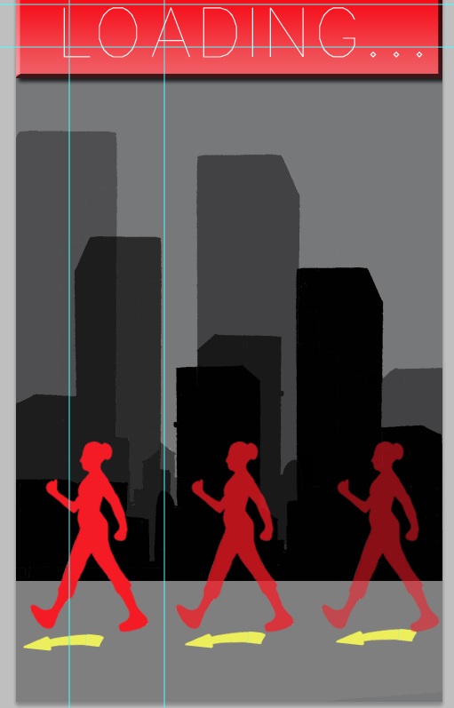
I liked this aesthetic, so I thought I could try to do my own version, so that I'm not just copy + pasting an image from online, plus I can customize it to match the app better
I found some images of people running and turned them into sihlouettes so that I can pu them in the background.


I repeated the sihlouette and faded them out to emphasize movement, however, now it looks bland because the colours are just repeating and it looks too simple. Also I think that the boxes need to have rounded corners so that it looks less harsh. My attempt at making the boxes 3D meant that I added and effect and gradient, which kind of worked, but I think that rounded corners will add to it.

I tried introducing a third colour- grey, but no way in hell will I use this certain concept, it looks wierd with the gradient of the boxed, and against the blue, the grey looks brownish.


developing layout

So I decided that the existing layout/aesthetics is too harsh and needs some serious attention because it looks basic and boring..
 For starters I think that the contrast is too strong and the font definately looks like it's a photoshop default font. Instead of dark blue, I thought of using two shades of lighter blue so that It's not tacky against the white font. Also, I've gone for a more handwritten style of font so that it corresponds with the whole journal theme. Also it's aimed towards a female target audience so this is a more theamatic approach...
However this still looks boring and plain, so I decided to add a background, but first look at existing apps and see how I can take inspiration from my findings.

Thursday 20 September 2012

interum

I started off with this basic layout for the interum. I stuck with the idea of using blue and white theme with notes of orange and yellow for a contrast of colour. So far I have 8 images, but as I develop my idea further, I'd like to add more features and functions.

Wednesday 19 September 2012

research

I want to make my app layout and graphics relevant to the purpose of the navigator, so I want to look up certain apps that help encourage fitness and health.

Weight watchers app
This is a screen shot of the weight watchers app, as I expected there is blue and white, which are the company logo colours, but also motivational colours, aswell as green to give it an emphasis of 'freshness'. Even though it's an app for tracking what you eat, it's still to do with health, so I think I would definately take som e inspiration from this app. In terms of Layout, the layout is simple and easy to follow. There is heirarchy so that the user finds it easy to follow, and the numbers are bold so that it catches your attention.

Nike running app
 The colours are unisex (black, white and red) and the red is energetic so it encourages the user tobe active. The layout is basic aswell but I think that it will be close to what I would do because it also keeps track of your progress by showing how many miles you've traveled with the date above. Also includes weather predictions, which is an awesome ideas!! and the symbols are userfriendly because they're easy to understand. This is actually really similar to my idea:(

wire frame and concept

My concept is to design a smartphone app, which acts as a navigator and calorie counter at the same time. The target audience will most likely be aimed towards a female audience, but not strictly. The idea is that as you are trying to find your way to your destination, the navigator will calculate how many calores the user has burned off, based on the time and distance travelled. What make this app innovative in terms of navigation, is that your camer on your smartphone is activated, thus, the user will be following bold arrows from the view of their camera. This way the user will be able to navigate from exactly where they are facing from and wont have to constantly look around to try and figure out whether they're on the matching street, like you wod on street view.

Wire frame


Tuesday 11 September 2012

sugar skull Pattern

I had absolutely no time to do this, but I did it anyway!
I love mexican sugar skulls so I found a black and white picture online and coloured it on photoshop!
and then I put it on repeat:
at one point I put in roses to make it look more traditional, but then it started to just look reaaly wack, so I just left it simple like this. I'd love to have this pattern on a button up shirt :D


Sunday 9 September 2012

interior navigation systems

In today's class, my tutor brought up the fact that we will be dealing with how we can use navigation systems in interioir spaces, so we were advised to look up existing navigation systems since there will need to be a user friendly way to allow the user to navigate the inside of a building, which is especially useful for when finding the room.

Link:
http://www.fraunhofer.de/en/press/research-news/2012/may/navigating-the-shopping-center.html
This website link talks about an interior navigation system that works by calculating how fast and how far a person in walking and can detect the direction that the individual is walking towards.

http://yuieo.blogspot.co.nz/2012/02/mapping-data-helps-users-navigate.html
This link directs you to a website that introduces the NAVTEQ, which is a navigation system that can navigate interior spaces, and can detect floor levels, and can detect if you are approaching stair cases and escalators

Wednesday 5 September 2012

more research!!

iDrive navigation systems for BMW
http://www.bmwusa.com/Standard/Content/Owner/iDrive/Overview/AdvantagesofOnBoardNav.aspx 
This link leads to a website that informs us on the features of the idrive. One feature that is important but never came accross to me before is the traffic notifications. This made me think of whether I could do something that informs the user of any traffic or obstacles such as road works etc and estimates any time delays or how much time it would hold up.

Phone Apps
Here is a website link that lists all the best smart phone/ i phone navigation apps
http://gizmodo.com/5656790/the-best-navigation-apps

From what I saw on the list, the best app according to this website is 'MotionXdrive'.
I looked it up and found some really interesting features and different editions have more or different features. Some that caught my attention were;

- Speed limit display that warns you how fast you are going (cars)
- can log in with facebook so that you can 'check in' to your final destination via facebook
-option to reverse the order of directions
-option to access the directions list from the map view.
-voice announcement etc

(information gathered from: http://news.motionx.com/category/motionx-gps-drive/)

The layout is very userfriendly, there are zoom in and zoom out options, arrows that point out the directions, a dial that uses symbols, such as hospital, airports, cafes and restraunts etc etc so that the user can just press one of the options and the navigation system will figure out which is the closest.

                                              Navigon phone application
I saw the layout for the navigon application. and I liked how you can choose between a map option, or a view like this ^ where it is the drivers point of view and large arrows show the direction.