Wendy Burton
this photograph is part of Burton's 'Rust Belt II' collection taken from:
http://flavorpill.com/losangeles/events/2008/9/3/dennis-hopper-colors-and-wendy-burton-trace-elements-iii
"Wendy Burton's long-standing passion for architectural photographs that document modern American "ruins" is seen in two new bodies of work, one examining the aftermath of Hurricane Katrina. Dennis Hopper picks up his creative thread as photographer and painter with rich visual dialogs between the smooth colors fields of mid-century abstraction (expressed as blocky anti-graffiti wall patches) and not-so-smooth images of inner-city social turmoil. Both series, while following diverse strategies, get straight to the point: there's beauty everywhere — you just need the patience to look."
This quote is taken from: http://flavorpill.com/losangeles/events/2008/9/3/dennis-hopper-colors-and-wendy-burton-trace-elements-iii
This image is interesting because the space is framed by the hole in the wall and the warm red colours contrast with the cool grey colours inside. There is shape created by the hole on the wall, but at the same time the viewer isn't too distracted from the centre of the photograph, where the empty space is the main focus in the image. The wall in front of the empty room give the illusion on a more dimensional image since it looks layered and complex.
This image is taken from 'rust belt II' collection from: http://www.wendyburton.net/series/rust_F15.html
"In, Wendy Burton’s fourth solo exhibition at Craig Krull Gallery, entitled Trace Elements III, the artist continues to explore abandoned and decaying structures as subjects for her photographic archaeology of the not so distant past in American civilization. These vacant buildings are often the product of what Burton refers to as the “rust belt,” areas where industry has moved on, resulting in the disintegration of entire communities. In Tema Celeste, Shana Nys Dambrot wrote, “…these are undeniable compelling subjects, saturated in a sort of rural collapse…yet the morbid lyricism of Burton’s tone is suggestive rather than judgmental…[their] meaning built on cobwebs and ghost stories.” This exhibition also includes a portfolio of images entitled, “What Remains,” made in post-Katrina New Orleans"
This quote is taken from : http://www.craigkrullgallery.com/exhibition/PRhopper.html
This image includes many photographic elements such as colour, line and composition, but I think what really stands out for me is how the wide shot makes this area look stretched, longer and almost endless, so this gives the image more depth and the space portrayed seems exaggerated and emphasised. This will encourage the viewer to pay attention to the narrow space between the walls and columns.
This image is taken from Burton's collection 'empty houses; interiors' from: http://www.wendyburton.net/series/interiors_F04.html
"Wendy Burton's evocative photographs document a part of the American landscape that is not usually associated with that country's shiny new facade. Her work features abandoned homes and buildings set like gemstones in areas where desolate wilderness merges with unkempt lawns. These are undeniably compelling subjects, saturated in the sort of rural collapse that city dwellers find quaint and picturesque. Yet the morbid lyricism of Burton's tone is suggestive rather than judgmental, privileging the florid decrepitude of the structures' current state over their previous occupancy. They hold an almost archaeological fascination for the viewer, inevitably an outsider, promising the discovery of an important story that one must finish for oneself."
This quote is taken from: http://www.wendyburton.net/press/main.html
This photo shows a barely furnished room, which shows the viewers the nature of the photographers concept for this image. The idea of abandonment and emptiness is clear in this photo and space is communicated by having minimal surroundings ie, no pictures on the walls, no curtains, no lampshades, no furniture except for a couch (and a mop leaning on the wall). This creates a lot of visual space because the viewers eyes drifts around the empty space all around the room, ignoring the couch and wonders what the story behind this picture is.
Josef Schulz
Image from 'Formen' collection from: http://www.josefschulz.de/html/form_90.html
"By removing any indication of function or use, the structures are reduced to relationships between color, shape and form. The artist produces a two-dimensional “sculpture” of the original structure through the photographic and digital editing processes. The final photographs are not presented as objective views of reality; instead, the images are revealed as carefully composed constructions"
This quote was taken from: http://www.yossimilo.com/exhibitions/2008_12-jose_schu/
This photo seems to be taken at a slightly lower angle rather than a straight on view, and this makes the distance between the bridge and the ground seem even bigger and expands the viewers perception of space in the image. This location looks deserted and unrealistic which draws in the viewers attention and allows them to focus on visual aspects such as the shape created by the bridge, the contrast between shadow and light etc...
This image is from the 'Ubergang' collection from: http://www.josefschulz.de/html/transitIndex.html
"my interest in these past places of border-line experience can be traced back to the story of my own life. I grew up in Poland, a country whose territory was repeatedly redefined in the course of history. The border police have now disappeared from our frontiers, too, and the border stations seem quite harmless today – but they will continue to conjure up unsettling images in our minds for many years to come."
This quote is taken from: http://www.josefschulz.de/html/uebergang_js_eng.html
This photo is simple yet effective because although it is a generic picture of the bridge, the distance from the bridge and where the picture was taken gives an appropriate view of the space around and inside the bridge and the light saturation woks with the idea behind the photo, because it slightly faded and nostalgic-looking so that Schulz shows the viewers his memory of his "border-line experience". the shadows are light wich makes the picture look more harmonious in my opinion which makes this setting look more appealing and attractive for the viewers eye
Edward Burtynsky
Image taken from 'Manufacture Landscapes'. Image from: http://www.google.co.uk/imgres?q=edward+burtynsky&um=1&hl=en&sa=N&biw=1440&bih=717&tbm=isch&tbnid=5zhKhzyf-xJrMM:&imgrefurl=http://everybodysucksbutus.com/2010/01/21/chinese-workers-photographed-by-edward-burtynsky/&docid=Jx2Ugg-vrvUTxM&imgurl=http://www.everybodysucksbutus.com/wp-content/uploads/2010/01/chinese-workers-1.jpg&w=600&h=400&ei=nSZqT9a9BsuXiQeim-WaCg&zoom=1&iact=rc&dur=482&sig=106546182176117871563&page=2&tbnh=157&tbnw=199&start=18&ndsp=24&ved=1t:429,r:0,s:18&tx=72&ty=112
"Sometimes we need to look at industrialisation in it's rawest form. Landscape photography is not just about capturing the essence of natural beauty in the world, it can also be a valid way of throwing up a mirror and exposing ourselves to who we really are and how we treat our environment"
Quote taken from: http://www.brucepercy.co.uk/blog/2011/10/02/edward-burtynsky-manufactured-landscapes/
this image, unlike the other photos i have explored, doesn't focus on isolation or abandonment, but still manages to capture the idea of space by filling up the space to show how big the room is rather than showing negative or empty space. It makes the image look less harmonious, and instead looks stressed and repetitive, which is not as relaxing for the viewer but works with the idea and message behind the photo.

image from 'manufactured landscapes' collection taken from: http://www.google.co.uk/imgres?q=edward+burtynsky+manufactured+landscapes&um=1&hl=en&sa=N&biw=1440&bih=717&tbm=isch&tbnid=joQUDnp55iUH1M:&imgrefurl=http://www.gradientmagazine.com/tag/edward-burtynsky/&docid=IsTEMeeS7cPtpM&imgurl=http://www.gradientmagazine.com/wp-content/uploads/2009/12/edward-burtynsky-manufactured-landscape-photography-01.jpg&w=504&h=400&ei=XE1qT4bkFK-PiAfg3YWPCg&zoom=1&iact=hc&vpx=371&vpy=238&dur=2192&hovh=200&hovw=252&tx=165&ty=151&sig=106546182176117871563&page=2&tbnh=153&tbnw=147&start=18&ndsp=24&ved=1t:429,r:7,s:18
"Burtynsky’s scenes, however, don’t exactly fill me with concern. Instead I’m dazzled by the ravishing kaleidoscopic patterns, the romantic lighting, the vast scale, and the profusion of detail captured on his large-format film. The 51-year-old often shoots from far away and high above, like a god watching impassively from the heavens. The world may be going to shit, but isn’t it pretty?"
Quote taken from: http://aesthetic.gregcookland.com/2007/02/edward-burtynsky.html
Burtynsky makes space look really artistic in this collection, because the patterns and flow of the image is composed in a really attractive way that creates movement in the image. The space in the centre is small but creatively framed by the surrounding tyres which gives a heavy contrast between simple, empty space and busy, messy surroundings.the high angle helps make this space look smaller and insignificant, as if it is being swallowed by the surroundings.


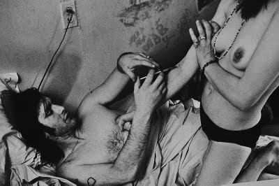


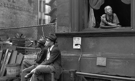


 From '8 Dead Palm Trees' image found on: http://www.fstopmagazine.com/blog/2012/02/j-bennett-fitts-kopeikin-gallery/
 image from 'no lifeguard on duty'. picture was found online on : http://www.google.com/imgres?hl=en&gbv=2&biw=1440&bih=720&tbm=isch&tbnid=BzOaDHDN7CEA0M:&imgrefurl=http://www.articlesandtexticles.co.uk/2006/08/16/j-bennett-fitts-no-lifeguard-on-duty/&docid=vdGn2P5ZS92ujM&imgurl=http://articlesandtexticles.co.uk/imgs/0608/bennett01x.jpg&w=750&h=599&ei=TX1eT9C8Ks-ViAej_LHDBw&zoom=1&iact=hc&vpx=1166&vpy=215&dur=474&hovh=201&hovw=251&tx=106&ty=136&sig=118108706221107151095&page=1&tbnh=165&tbnw=223&start=0&ndsp=15&ved=1t:429,r:14,s:0
 image from "bankrupt" collection, taken from: http://www.google.com/imgres?num=10&hl=en&gbv=2&biw=1440&bih=720&tbm=isch&tbnid=yKuUN56JrYtunM:&imgrefurl=http://shape-and-colour.com/2008/05/26/phillip-toledano-bankrupt/&docid=v1Ug5JCEp5mprM&imgurl=http://shapeandcolour.files.wordpress.com/2008/05/bankrupt1.jpg&w=500&h=354&ei=xY5eT4npFaSdiAertvH1Bw&zoom=1&iact=hc&vpx=448&vpy=166&dur=980&hovh=189&hovw=267&tx=193&ty=91&sig=118108706221107151095&sqi=2&page=1&tbnh=163&tbnw=219&start=0&ndsp=15&ved=1t:429,r:1,s:0
 image from 'Bankrupt' collection from: http://www.google.com/imgres?start=15&num=10&hl=en&gbv=2&biw=1440&bih=720&tbm=isch&tbnid=gWFy_D_eMXf8NM:&imgrefurl=http://keef.tv/blog/archive/category/places/&docid=FvN0NEbJFPgx9M&imgurl=http://keef.tv/images/uploads/Toledano1.jpg&w=500&h=384&ei=LpJeT6_ZNoOdiAfu7bnPBw&zoom=1&iact=hc&vpx=991&vpy=120&dur=1&hovh=197&hovw=256&tx=123&ty=123&sig=118108706221107151095&sqi=2&page=2&tbnh=149&tbnw=187&ndsp=24&ved=1t:429,r:4,s:15
 image from 'twilight' display from: http://www.google.com/imgres?hl=en&gbv=2&biw=1440&bih=720&tbm=isch&tbnid=5y44iqMcMeFMWM:&imgrefurl=http://www.dezeen.com/2011/04/17/twilight-by-tokujin-yoshioka-for-moroso/&docid=E5pq6cTdQYL9LM&imgurl=http://static.dezeen.com/uploads/2011/04/dzn_Twilight-by-Tokujin-Yoshioka-for-Moroso-141.jpg&w=468&h=468&ei=d5deT_iyDoOViAe9tNnqBw&zoom=1&iact=hc&vpx=789&vpy=365&dur=2703&hovh=225&hovw=225&tx=101&ty=153&sig=118108706221107151095&page=1&tbnh=144&tbnw=144&start=0&ndsp=19&ved=1t:429,r:16,s:0
 picture of rainbow church from his 'spectrum' display from: http://www.google.com/imgres?hl=en&gbv=2&biw=1440&bih=720&tbm=isch&tbnid=r4Fj1HM7JnqYFM:&imgrefurl=http://brocadedesignetc.blogspot.com/2011/04/rainbow-church-tokujin-yoshioka.html&docid=azAt9wgk57uoWM&imgurl=http://2.bp.blogspot.com/-KlyTbLq3gE8/TazbeulpDbI/AAAAAAAAESo/SlLbwbvQfPY/s1600/001_rainbow.jpg&w=424&h=590&ei=d5deT_iyDoOViAe9tNnqBw&zoom=1&iact=hc&vpx=1029&vpy=193&dur=1148&hovh=265&hovw=190&tx=85&ty=171&sig=118108706221107151095&page=3&tbnh=167&tbnw=76&start=43&ndsp=25&ved=1t:429,r:11,s:43