This is a wide angle shot which is slightly raised to a higher point in order for the viewer to focus on the actual space which should be the dominant image, as opposed to the grafitti on the walls. this area works with the idea behind my vision for this project because it shows how this space is may seem isolated but it's open atmosphere allows the audience to see the big and small details, such as the curly pattern created by the barb wire, the spiral-shaped ramp inside the car park and the merge of colour and grey.
i will look into improving this picture because I like how the narrow space is clearly visible and filled with all kinds of 'junk' which brings a lot of character into this photo as it shows this area in a less pristine and less boring space. Everywhere you look there's something interesting.
A closer look behind the bars where the space seems more narrow yet the space and surroundings create a more eerie feeling as the space seems more closed in and even darker.The focus turns from space and atmosphere to the shapes and linear features in this space.
This side angle helps the photograph concentrate on the rubbish and skip bins, and how the perfect line-up and arrangement of these objects allows the viewer to see order in a seemingly un-ordered place, where the irony of perfectly lined up rubbish bins is clashed with the fact that the rubbish that surrounds this place is everywhere except inside the rubbish
An extreme high angle allows the audience to see a different angle and works well when an area is crammed with many objects because the viewer will get to see the spaces between the objects, where a normal angled shot wouldn't be able to show that kind of detail. At this angle, the viewers would also recognize the shape created by the empty space.
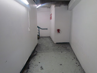
This serves as a contradiction to the outside of the car park, where the atmosphere is open, messy and extremely detailed, whereas this small room is plain, closed-in, bright but neat and almost sanitary-looking in comparison to the rubbish-covered areas outside. this image, to me, adds character and variation to the entire building because it creates a completely different mood (even though it's dull) and this dullness allows the viewer to appreciate the simplicity of this space.
this photograph is dark, so it could be enhanced to show the actual main part of the car park clearly. this is a more typical photograph of a car park, however I think that the wide angle shot that is framed by the rows of parked cars could also contribute to the style and mood mixed with the dark lighting which gives off a serious mood, unlike the playful moods outside, the car park shows more dull and uniformed images inside.
Spaces between the levels create pattern and repetition which helps build movement that directs towards the ceiling, allowing the viewer to notice the triangular form above. a low angle helps achieve this view of the ceiling and tall buildings.
I this picture i wanted to have the focus begin from the start of the ramp and extend just past the entrance of the car park. i put myself in the eyes of the driver and wanted to capture the feel of the driver as they drive along the ramp, into the dark parking lot expecting to find a place to stop and park their car. this shot works with idea because the darkness evokes the uncertainty of finally finding a place to park.


No comments:
Post a Comment